All Blogs & Seller News
Amazon has a new marketplace switcher which looks totally weird

As you know, Amazon is constantly working hard on making every possible feature on their platform more complicated for sellers to use. During the past few years, the overall interface experience worsened and the Seller Central main page no longer contains any useful information which was previously available immediately after logging in.
This week, Amazon US enrolled their new, terrible design of the international marketplace switcher. The widget displays on the top of the Seller Central home page.
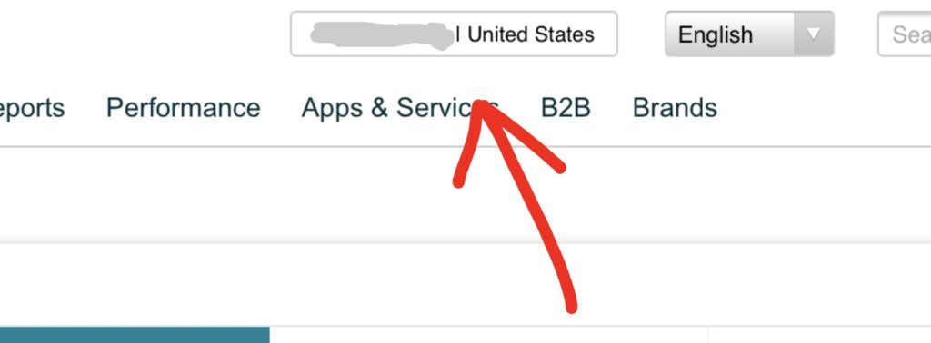
Instead of the original large round-edged button with 3D shadow borders, there is a tiny nearly invisible rectangle, which reveals microscopic names of countries. Country flags are missing and individual marketplaces are in a chaotic order, without any reasonable sense.
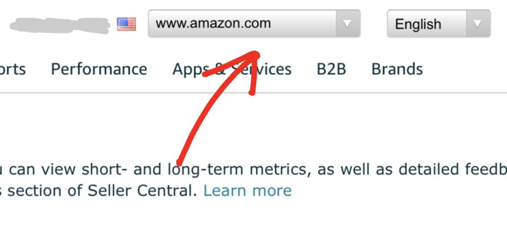
Here you can view the original button:

And here is the latest, simple rectangular version, which also lacks the website domains of each Amazon marketplace in question:

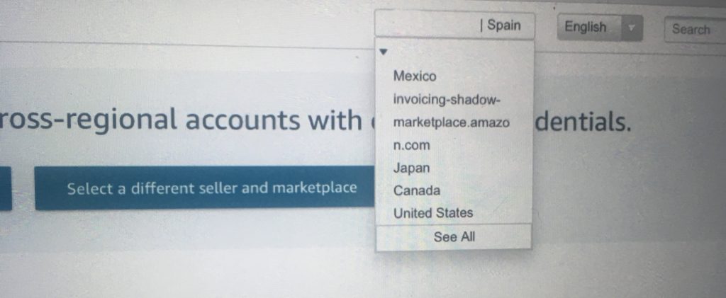
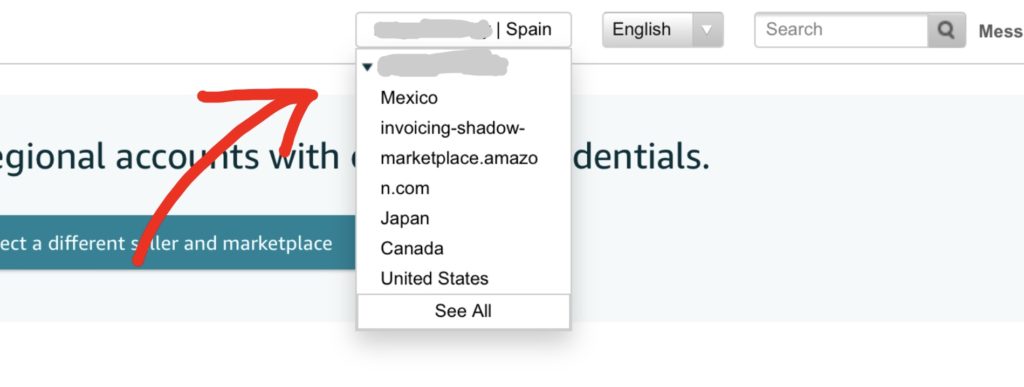
Clicking on the microscopic marketplace switcher will either reveal a chaotic list of countries or lead to a separate page with weird large rectangular choices:

List of choices, where you can “Select an Account”:

It is clear what Amazon expects to see in the future – third party Amazon sellers having all their international and duplicate Seller Accounts linked together in this “account switcher”, so they can then enforce suspensions in a single go, across all accounts and countries. When in the past, each account was judged separately.
Read my previous article regarding the matter, where I am warning you about Unified Accounts and telling you, why you should never link them together.
➡️ If you are an Amazon Seller who needs help with any Amazon-related issues such as suspensions, listing blocks or is looking for professional assistance, please don’t hesitate to subscribe to my new OnlyFans page at: www.onlyfans.com/kikaangelic


You must be logged in to post a comment Login